✺
“Building a brand from the can up.”
The seltzer category is known for its stereotypical portrayal of the CIS audience. Our mission was to craft a brand that translated the uniqueness of this hemp-infused product and also the uniqueness of real people.
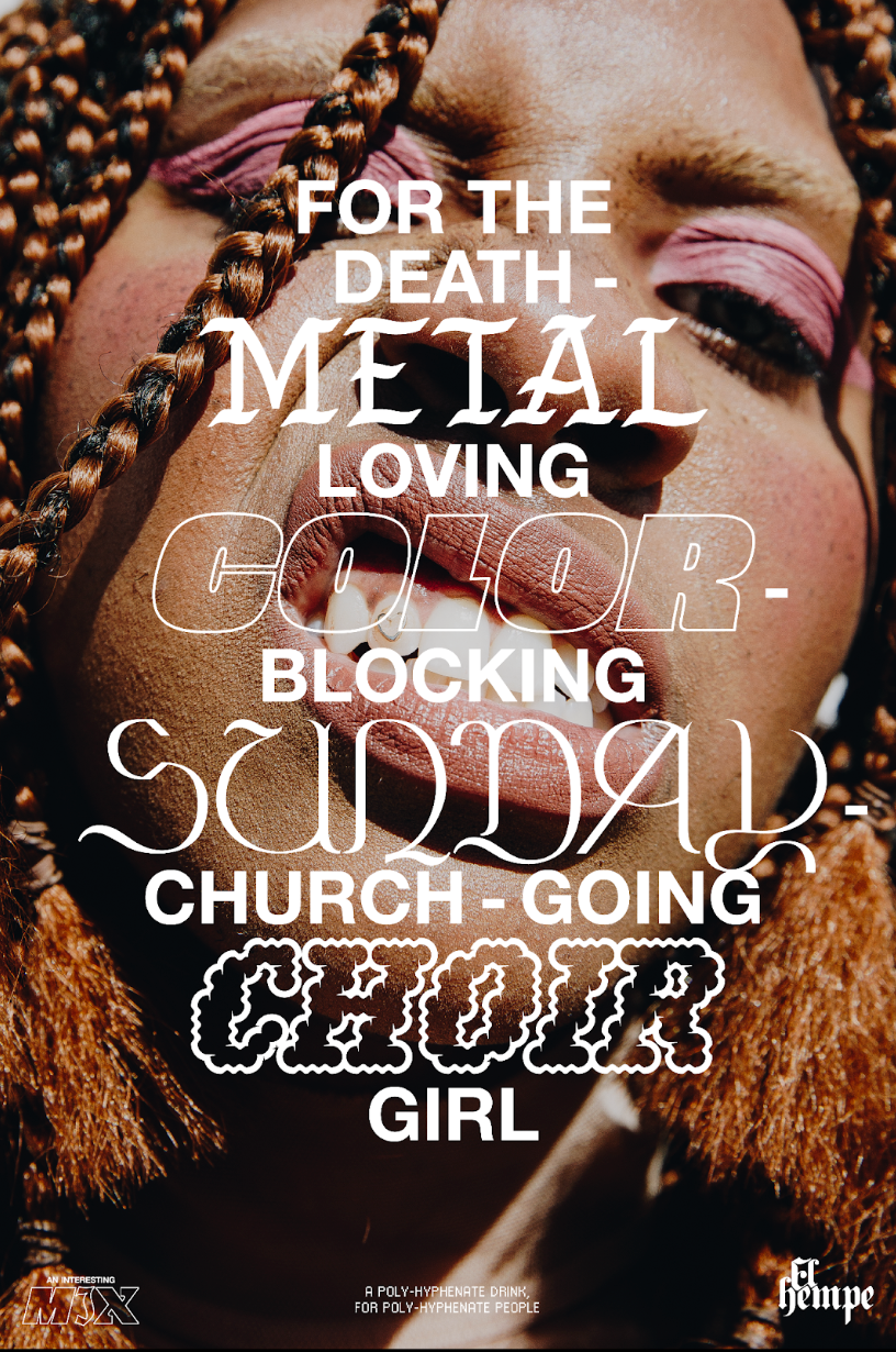
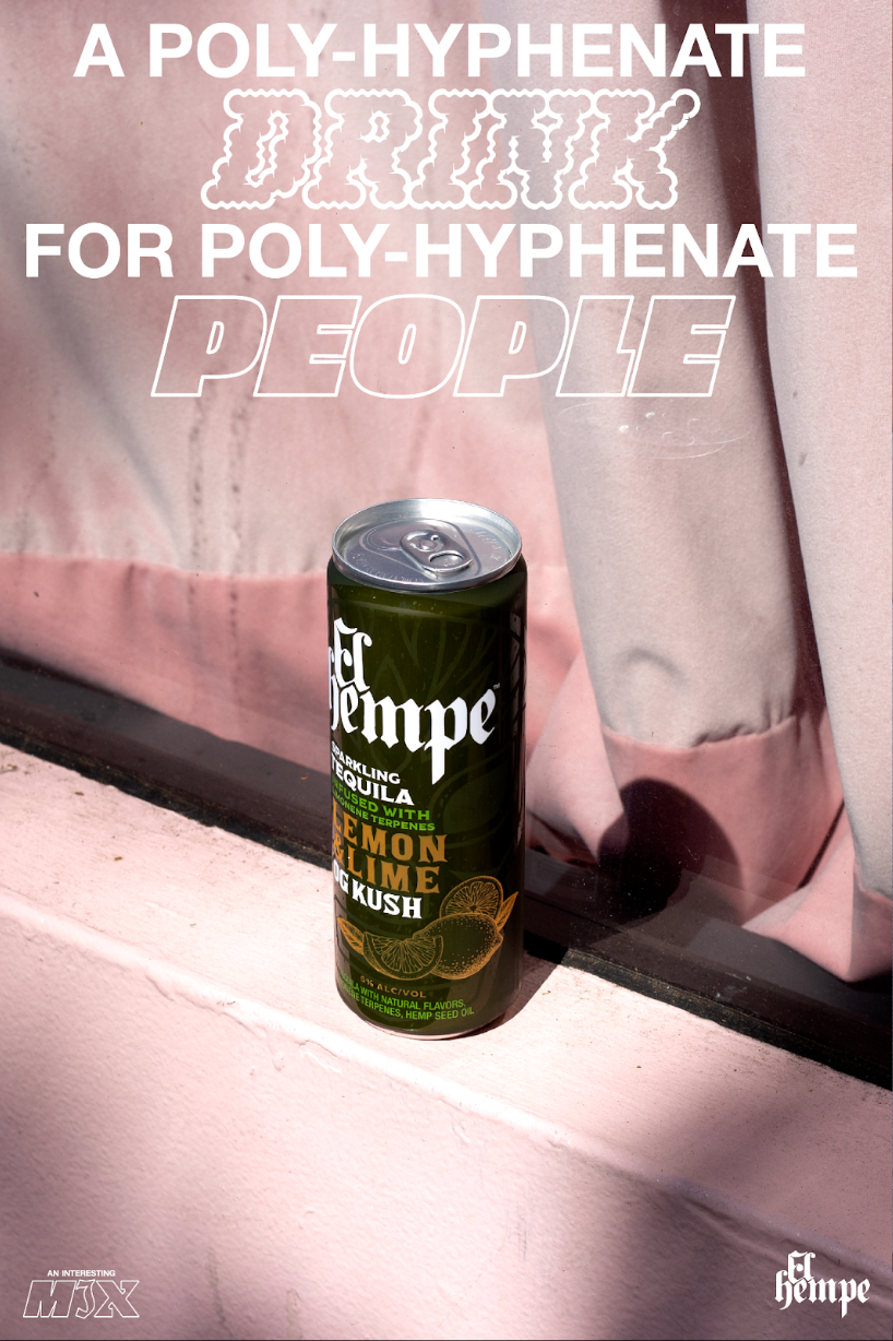
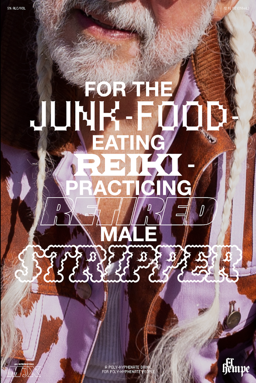
When the category reduced their audience’s interests to pool parties, fruity taste and colorful graphics, we set out to celebrate the interesting mix we all are. Our design system contradicted the cliches of the category. Every piece translated the interesting mix in our product and audience. Instead of 1 or 2 fonts, we mixed in 8.
We used a black and white palette and allowed the color of the words and the people to shine.
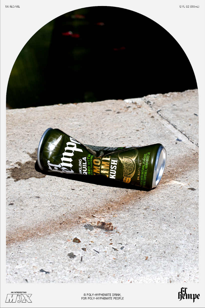
Illustrations and photography, both product and lifestyle, were raw and authentic to juxtapose the plastic feel of the category.
+ +


+ +
Client: El Hempe // Agency: David & Goliath, Los Angeles // Illustration: Michael Molinaro, Los Angeles & Fabio Barros, New York
